ASCEND DESIGN SYSTEM REBUILD
Fostered stronger collaboration between design and engineering teams, creating a unified approach to solving complex problems.

Timeline
Q3 2023 - Q2 2024
Team
1 Design Systems Lead
1 Product Designer
1 Engineer Lead
1 Engineer Manager
1 Engineer
Role
Product Designer
Tools
Figma
Supernova
Overview
I co-led the redesign and redevelopment of the Ascend Design System, bridging the gap between design and code. This initiative enhanced UI consistency across products, optimized workflows, and strengthened collaboration between design and engineering teams, driving efficiency and scalability at Achieve.
PROBLEM
How might we improve our current design system to make it more consistent, scalable, and foster seamless collaboration between designers and developers?
BUSINESS IMPACT
Slower Time-to-Market
Inefficiencies in component use delayed product launches

Increased costs
More design and development hours spent fixing inconsistencies

Accessibility issues
Lack of adherence to accessibility standards due to component inconsistencies

Difficulty in scaling
Lack of a strong foundation hindered future expansion of the system

AUDITING ASCEND 1.0 (PREVIOUS STATE)
I conducted a thorough audit of Ascend 1.0 and surveyed designers and engineers to uncover key issues.

Inconsistent component names
Different naming conventions between design and code

Inconsistent properties
Mismatched settings between Figma and development implementation

Detached styles
Lack of alignment in typography, spacing, color usage

Broken components
Non-functional elements in design files

Synthesizing findings from the audit and survey, we established key themes to target for Ascend 2.0.


PROCESS OF ASCEND 2.0
Here’s an example of the Button component. We ensured all variants and properties of each component we build are properly named and aligned in both Figma and Code.

Step 1: Cross reference how it is built in code
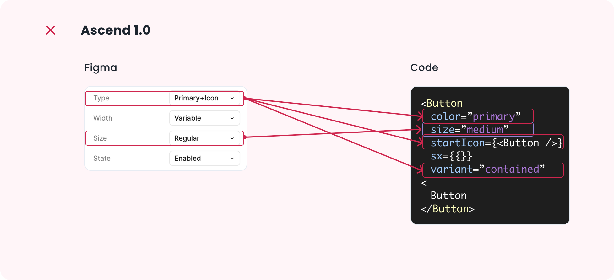
For example, the “Size” property is labeled as “Regular” in Figma, while in code, it is referred to as “Medium.” These discrepancies in properties and variants led to inconsistencies in styling, behavior, and overall usability across the system.

Clear, standardized property and variant names in Figma and code for seamless alignment.
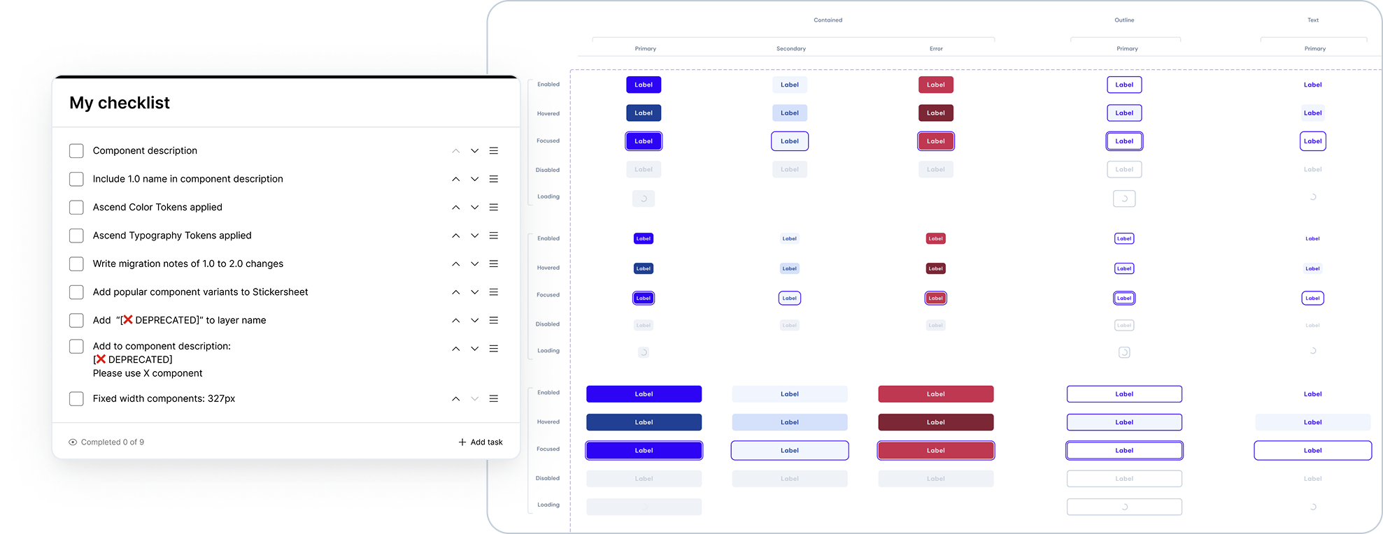
Step 2: Categorize variants to align with MUI Library

Grouped all variants under a single property, making it challenging for designers to navigate and select the right option.

Variants are organized into distinct categories, aligning with MUI and code for a more intuitive and seamless workflow.
Step 3: Apply the color and typography tokens


Step 4: Design review
Review component to ensure that it is built properly, all tokens are applied, and variants match code.
Step 5: Finalize design and engineer handoff
Walkthrough component with an engineer and document for engineering implementation.

Step 6: Documentation using Supernova
Established guidelines for naming, usage, and accessibility best practices.


