
CalTime Redesign
Duration: 3 weeks (March - April 2020)
Team: Mattin Delavar
Role: User Research and UX Designer Co-Lead
Tools: Figma
Deliverables: Research-informed redesign of student-facing timekeeping platform
Defining the Problem
How might we design a more delightful experience for student employees at UC Berkeley as they record their hours?
CalTime is a timekeeping system that UC Berkeley student workers use to keep track of their timecards. Through our user research, we identified students’ frustrations and needs. By refining the current features, we added features that better supported students with multiple jobs including a mobile app and a scheduled reminder system that reminds users to clock in/out.
Current CalTime Interface:

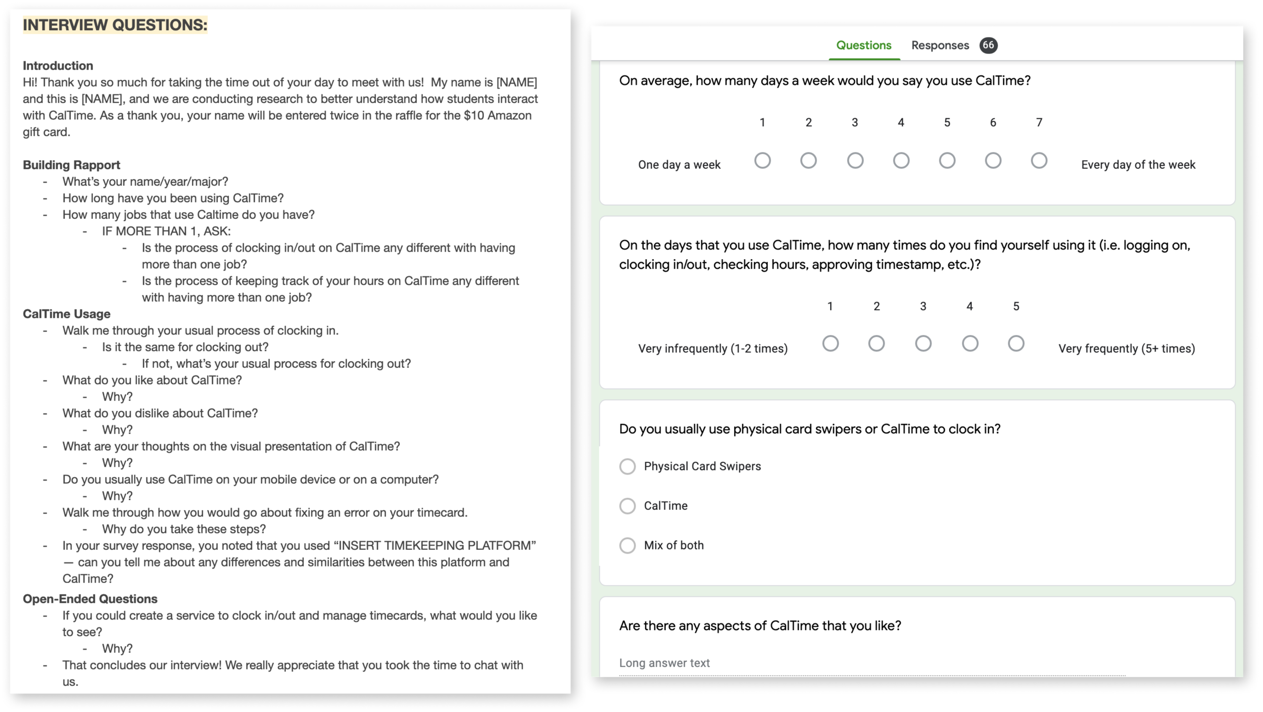
User Research
We virtually interviewed 5 UC Berkeley student workers and surveyed over 60 UC Berkeley student workers by posting it on several social media platforms (LinkedIn, Facebook groups, Slack workspaces) to better understand our user’s frustrations, motivations, and needs.
Key Insights:
Users find it difficult to organize hours when they have multiple jobs
Users do not like the current visual interface of the timekeeping platform
Users want a method of correcting their hours through CalTime so their pay statements are accurate
Users value that convenience of being able to to clock in anywhere/anytime
Users want the ability to clock in from their phones for convenience, not just from a web browser
Users often forget to clock in/out of their shifts
To synthesize all the user research, we made an affinity map to better organize the key insights that we learned.
Ideation
We first brainstormed individually by writing down the different ideas that we thought would better improve the experience for UC Berkeley student workers. We grouped our similar ideas that consisted of functionality needs, error management, visuals, and accessibility.
User Flows
We made user flows for the current CalTime website and a proposed CalTime user flow based on our user research to better visualize the user’s interaction with the timekeeping system.
Current User Flow:
Proposed User Flow:
Low-Fidelity Prototype
After mapping out the existing user flow of CalTime, we sketched what the web and mobile screens would look like with our proposed user flow.
Mid-Fidelity Prototype: Web
We moved onto creating our mid-fidelity sketches using Figma.
Home Page / Timecard: One of CalTime’s main purposes is to maintain fair and accurate data for employees. This page is designed to make it convenient for users to clock in and out of their shifts.
Reminders & Projections: From our user research insights, users often forget to clock in/out of their shifts. This page tackles that issue by allowing users to add their new shifts to their schedule, so they can receive notifications to clock in/out. Users can also calculate their pay projection to see how much they will get paid for the inputted hours to reach their personal needs and goals.
Timecard Corrections: Employees are able to submit a timecard correction form to their supervisor and are able to view the status of the form. This reduces the hassle for both the employee and supervisor to organize the forms on an external platform (i.e. Slack, Google Sheets, email, etc).
Mid-Fidelity Prototype: Mobile
We created a mobile version to make it more convenient for users to clock in/out and to receive reminders on their inputted schedule.
User Testing
We created a user testing guide and user tested 5 student employees who currently use CalTime. We user tested our mid-fidelity prototype to learn more about the users’ experience with the user flow. We asked general questions about the interface and whether the actions from each page were effective. During the user test, we learned that some visual icons were difficult to understand, so we used the feedback to improve our design when moving into high-fidelity prototypes.
Some user insights we received:
High-Fidelity Prototype: Web
Hi-Fidelity Prototype: Mobile
Reflection
Since COVID-19 cancelled our Spring Break plans, Mattin and I decided to work on this design project to occupy the extra time and to hone our design skills. As a UC Berkeley student worker myself, this project was very fun and relatable. Through the interviews and user testing conversations, people mentioned that our redesign would help alleviate the frustrations they had with the current CalTime design. This project has been very rewarding and I am thankful for the new skills I learned and Mattin who supported me the throughout the project.
